
PDF 生成模板编辑器
开源可视化 PDF 生成引擎,支持自定义模板,并提供面向开发者的 API,灵活构建文档生成流程。
Web 平台的自定义 UI,很重要的一个部分是对导航栏的自定义。对导航栏进行自定义,您可能会用到几个操作,比如:
ComPDF for Web 的 WebViewer UI 提供了灵活的 API 来轻松自定义导航栏。
要了解导航栏的结构和不同类型的工具项,您可以阅读本章节的导航栏组成和导航栏工具项部分。您也可以直接跳到示例部分,查看自定义导航栏的示例。
导航栏主要分成三个部分:导航工具、功能区和对应功能的二级菜单栏(包含子工具栏)。
导航工具: 下图(导航栏)左右两侧的图标按钮属于导航工具。

功能区: 在导航栏中间、框内的部分,称为功能区(如下图所示)。每个功能都有不同的二级菜单栏。不论是功能区还是二级菜单栏的按钮,都是可以单独修改的。 
二级菜单栏: 在不同的功能区下有其对应的二级菜单栏,二级菜单栏中会显示对应功能的一组工具。ComPDF for Web 提供多种 API 来自定义该二级菜单栏的工具。下面展示的是注释和表单功能的二级菜单栏:


查找导航栏数据元素属性值
要隐藏/显示导航栏元素,首先必须从 DOM 检查器中找到元素的data-element属性。
例如,下图是功能区的 DOM 部分:
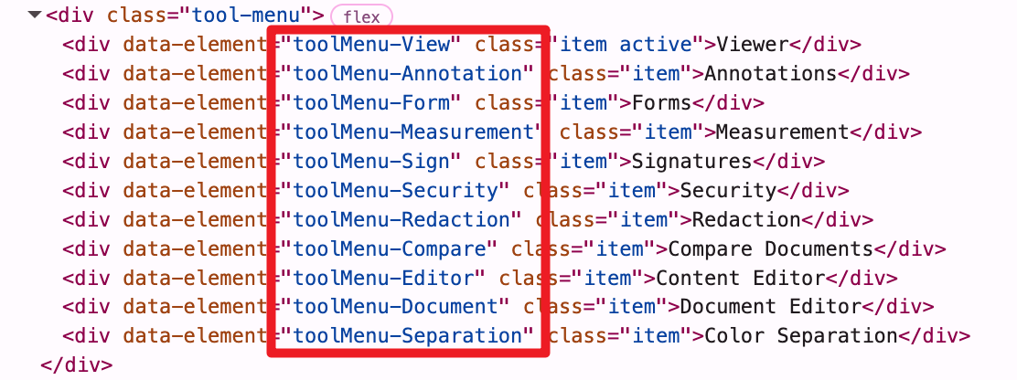
我们可以看见它们的data-element值,现在我们可以使用该值来隐藏/显示它。
隐藏/显示导航栏元素
// 隐藏功能区的注释功能按钮。
instance.UI.disableElements('toolbarGroup-Annotation');
// 显示功能区的注释功能按钮。
instance.UI.enableElements('toolbarGroup-Annotation');// 隐藏左侧面板按钮和搜索按钮。
instance.UI.disableElements(['leftPanelButton', 'searchButton']);
// 显示左侧面板按钮和搜索按钮。
instance.UI.enableElements(['leftPanelButton', 'searchButton']);可调用setToolbarGroup,来切换功能区中的功能模式。
ComPDFKitViewer.init(...)
  .then(instance => {
    // 设置当前选中的功能区。
    instance.UI.setToolbarGroup('toolbarGroup-Annotation');
});导航栏工具项是具有某些属性的对象。我们可以通过调用setHeaderItems来添加、删除、移动导航栏的按钮。如果您希望在导航栏添加自定义工具,了解您需要添加的自定义工具是什么类型以及应使用哪些属性非常重要。下面将介绍导航栏工具项的属性和类型。
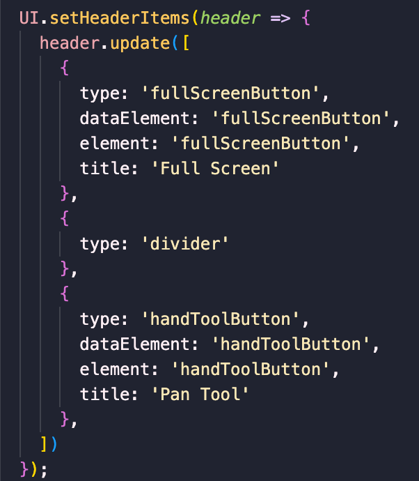
instance.UI.setHeaderItems(header => {
  header.update([
    {
      type: 'toolButton',
      dataElement: 'handToolButton',
      toolName: 'pan',
      icon: 'Pantool',
    },
    {
      type: 'toggleElementButton',
      dataElement: 'searchButton',
      element: 'searchPanel',
      icon: 'Search'
    },
    { type: 'divider' },
    {
      type: 'actionButton',
      dataElement: 'downloadButton',
      icon: 'Download',
      onClick: download
    }
  ]);
});1. 设置 Header
setHeaderItems回调函数的参数:header对象,可以调用get、getItems、shift、unshift、push、pop、delete和update来对导航工具和功能区进行对应的操作。
instance.UI.setHeaderItems(header => {
  // 获取所有功能区。
  const items = header.getHeader('default').getItems();
  console.log(items);
});2. 动作按钮
动作按钮可以触发一个操作。该按钮没有活跃状态。其属性包含:
actionButton。components/Icon 文件夹下的文件名。data-element 按钮元素值的可选项。它可用于显示/隐藏该元素。desktop、tablet、mobile 和 small-mobile。const newActionButton = {
type: 'actionButton',
img: 'path/to/image',
text: 'Alert',
onClick: () => {
alert('Hello world!');
},
dataElement: 'alertButton'
};3. 状态按钮
状态按钮是一个可自定义的按钮。您可以决定它有多少个状态、什么状态是活跃的以及何时更新状态。其属性包含:
statefulButton。states对象的键之一的字符串。activeState。activeState是 states 中对应的 initialState 值的对象。activeState。activeState是 states 中对应的 initialState 值的对象data-element的功能按钮。desktop、tablet、mobile 和 small-mobile。示例:
显示计数的状态按钮。当你点击它时,它会将计数器加 1。
const countButton = {
  type: 'statefulButton',
  initialState: 'Count',
  states: {
    Count: {
      number: 1,
      getContent: activeState => {
        return activeState.number;
      },
      onClick: activeState => {
        activeState.number += 1;
      }
    }
  },
  dataElement: 'countButton'
};显示当前页码的状态按钮。当您单击它时,文档将转到下一页。如果您已经翻到最后一页,文档将转到第一页。
const nextPageButton = {
  type: 'statefulButton',
  initialState: 'Page',
  states: {
    Page: {
      getContent: Core.getCurrentPage,
      onClick: activeState => {
        const currentPage = Core.getCurrentPage();
        const totalPages = Core.getPagesCount();
        const atLastPage = currentPage === totalPages;

        if (atLastPage) {
          Core.previousPage();
        } else {
          Core.nextPage();
        }
        activeState.getContent = Core.getCurrentPage();
      }
    }
  },
  mount: () => {
    // 挂载后执行。
    console.log('Mounted.');
  },
  unmount: () => {
    // 销毁前执行。
    console.log('Destroyed.');
  },
  dataElement: 'nextPageButton'
};4. 切换元素按钮
切换元素按钮可用来打开/关闭指定的 UI 元素。当 UI 元素打开时,该按钮处于活跃状态。
其属性包含:
toggleElementButton。components/Icon 文件夹下的文件名。data-element 属性值。data-element 按钮元素值的选项。它可用于显示/隐藏该元素。desktop、tablet、mobile 和 small-mobile。const newToggleButton = {
type: 'toggleElementButton',
img: `path/to/image`,
element: 'pageModePanel',
dataElement: 'pageModePanelButton',
hidden: [ 'mobile' ]
};5. 工具按钮
工具按钮是功能模块下的二级菜单栏中的工具。例如,在 Form 功能模式下,自定义一个工具按钮,并指定该工具按钮的元素值为 textfield 时,即可创建一个文本框的功能按钮。可将您需要自定义的的工具按钮放置在任意位置。当工具被激活时,该按钮处于活跃状态。
属性:
toolButton。data-element 元素值。- icon(字符串) - 图标名称,WebViewer 中 components/Icon 文件夹下的文件名。data-element 的功能按钮。desktop、tablet、mobile 和 small-mobile。const newToolButton = {
type: 'toolButton',
toolName: 'textfield',
dataElement: 'textfieldButton'
};6. 间隔器
间隔器只是一个具有flex: 1 CSS 属性的div,用来占据任何剩余空间的工具。它用于将按钮推到默认标题的每一侧。
间隔器属性包括:
spacer。desktop、tablet、mobile 和 small-mobile。const newSpacer = {
type: 'spacer',
hidden: [ 'mobile', 'small-mobile' ]
};7. 分隔线
分隔线呈现一个带有一定边距的垂直条来分隔项目组。
分隔线属性包括:
divider。desktop、tablet、mobile 和 small-mobile。const newDivider = {
type: 'divider',
hidden: [ 'mobile', 'small-mobile' ]
};添加自定义保存按钮:
instance.UI.setHeaderItems(header => {
  const mySaveButton = {
    type: 'actionButton',
    dataElement: 'mySaveButton',
    img: `<svg width="14" height="14" viewBox="0 0 14 14" fill="none" xmlns="http://www.w3.org/2000/svg">
            <path d="M13 1L1 13" stroke="#BABABA" stroke-width="2" stroke-linecap="round" stroke-linejoin="round"/>
            <path d="M1 1L13 13" stroke="#BABABA" stroke-width="2" stroke-linecap="round" stroke-linejoin="round"/>
          </svg>`,
    onClick: function() {
      Core.download();
    }
  }
  header.push(mySaveButton);
});隐藏表单功能区的文本域工具,并将其放至导航栏右侧:
instance.UI.setHeaderItems(header => {
  // 获取 freetext 工具。
  const freetext = header.getHeader('toolbarGroup-Annotation').get('freetextButton');
  header.getHeader('toolbarGroup-Annotation').delete('freetextButton');
  // 将 line 工具添加到顶部导航栏。
  header.getHeader('default').push({
    type: 'toolButton',
    toolName: 'line',
    dataElement: 'lineButton'
  });
  // 将 freetext 工具添加到顶部导航栏。
  header.push(freetext);
});移除导航栏现有按钮, 仅保留功能区:
instance.UI.setHeaderItems(header => {
  const ribbon = header.getItems().find(item => item.render === 'Ribbons');
  header.update([ribbon]);
});底部页码框的显示与隐藏:
// 隐藏底部页码框。
instance.UI.disableElements('pageNavOverlay');
// 显示底部页码框。
instance.UI.enableElements('pageNavOverlay');