
PDF Generation Template Editor
Open-source visual PDF generation engine with customizable templates and developer-friendly APIs.
When creating a CPDFReaderView, you can customize the context menus that appear when annotations, text, images, or form fields are selected. This is done via the CPDFConfiguration object using the contextMenuConfig field.
Default Context Menu
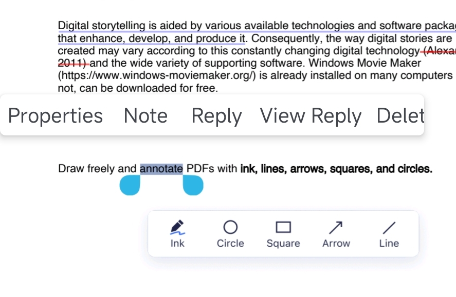
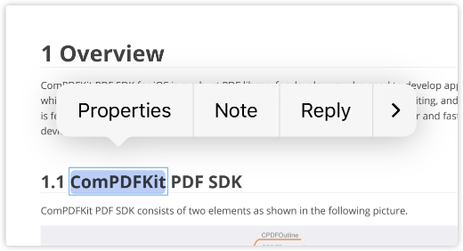
By default, when a user selects a highlight annotation, ComPDF displays a context menu with common options such as “Note”, “Delete”, and “Properties”:
| Android | iOS |
|---|---|
 |  |
Customizing Menu Items
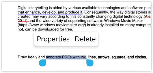
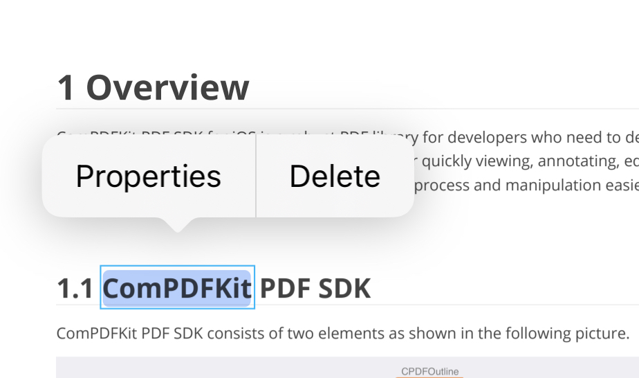
You can customize the context menu by specifying which menu items to include. The following example only keeps the Properties and Delete options for highlight annotations:
<CPDFReaderView
  ref={pdfReaderRef}
  document={samplePDF}
  configuration={ComPDFKit.getDefaultConfig({
    contextMenuConfig:{
      annotationMode: {
        markupContent: menus('properties', 'delete')
      }
    }
})} />| Android | iOS |
|---|---|
 |  |
Custom Menu Items
The ComPDF React Native SDK added support for custom menu items in version 2.6.0. The following example demonstrates how to add custom menu items to the context menu for highlight annotations.
Step 1: Configure Custom Menu Items
Create a CPDFContextMenuItem instance to configure custom menu items:
<CPDFReaderView
  ref={pdfReaderRef}
  document={samplePDF}
  configuration={ComPDFKit.getDefaultConfig({
    contextMenuConfig: {
      padding: [4, 0, 4, 0],
      iconSize: 40,
      fontSize: 14,
      annotationMode: {
        markupContent: menus(
          {
            key: "custom",
            identifier: "custom_show_annotation_properties_action", // Required: unique identifier
            title : 'Custom Action',             // Required: menu title (when showType is text)
            icon: "ic_test_properties",          // Optional: icon name (Android only, required when showType is icon)
            showType: "text",                    // Display type: icon or text
          }
        ),
      }
    },
  })}
  onCustomContextMenuItemTapped={handleCustomContextMenuItemTapped}
/>Step 2: Handle Click Events
Handle click events for custom menu items through the onCustomContextMenuItemTapped callback:
const handleCustomContextMenuItemTapped = (identifier: string, event: any) => {
  if (identifier === 'custom_show_annotation_properties_action') {
    // Handle custom menu item click event
    // For example: display custom dialog, perform specific operations, etc.
    console.log('Custom menu item tapped:', event);
  }
};Context Menu Configuration Fields
| Field | Description |
|---|---|
backgroundColor | Context menu background color. Android only. |
fontSize | Text size of context menu items. Default is 14. |
padding | Menu padding in [left, top, right, bottom] order. Android only. |
iconSize | Icon size. |
key | Built-in menu key. Use custom for custom menu items. |
identifier | Unique identifier returned by onCustomContextMenuItemTapped for custom menu items. |
title | Menu text when showType is text. |
icon | Icon resource name. Use it with showType: "icon". |
showType | Display mode, "text" or "icon". |
Platform note: Android supports additional visual styling such as
backgroundColorandpadding. On iOS, focus on menu contents and custom callback handling.