Customize Panels
Panels are dynamic components in WebViewer UI, designed to enhance user interaction by displaying content either on the left or right side. This guide provides detailed instructions and examples for incorporating both prebuilt and custom panels into your UI, offering a seamless integration process.
Prebuilt Panels
The UI includes a comprehensive selection of preconfigured panels designed to address common functionality requirements, such as thumbnail manipulation and document outline navigation. Through the use of the provided APIs, you can seamlessly integrate these panels into your UI. Additionally, you have the flexibility to customize various aspects of their behavior, such as the side of the UI from which they open.
List of Prebuilt Panels
- leftPanel
- rightPanel
- pageModePanel
- stampPanel
- linkPanel
- contentEditorPanel
- stylePanel
- colorSeparationPanel
Integrating Prebuilt Panels
To incorporate a prebuilt panel, utilize the addPanel API, specifying necessary properties such as dataElement, location and render. For prebuilt panels, render corresponds to a reserved identifier, while for custom panels, it involves a function returning the panel element.
// Menu Panel
instance.UI.addPanel({
  dataElement: 'leftPanel',
  location: 'left',
  render: 'leftPanel'
});

// Page Mode Panel
instance.UI.addPanel({
  dataElement: 'pageModePanel',
  location: 'right',
  render: 'pageModePanel'
});To open the panels, you can use the API openElement with the dataElement of the panel. You can also add a toggle button to your UI and use the selector of the panel as the toggleElement of the button.
// Using the openElement API to open the Page Mode panel
instance.UI.openElement('pageModePanel');

// Using the toggle button to open the Page Mode panel
const newToggleButton = {
  type: 'toggleElementButton',
  element: 'pageModePanel',
  dataElement: 'pageModePanelButton',
  text: 'Page Mode'
};
instance.UI.setHeaderItems(header => {
  header.push(newToggleButton);
});Adding Custom Panels
If you want to customize your UI even more, the Modular UI framework lets you build panels exactly the way you want. This means you can create special components that fit perfectly with what your app needs. You still use the same properties when creating panels with the prebuilt options. However, instead of passing a panel element identifier directly to the render property, you pass a function that returns the panel element. This element can be a DOM element built with JavaScript, giving you the flexibility to tailor your UI components to your specific requirements.
// Adding a panel built with JS and DOM elements
instance.UI.addPanel({
  dataElement: 'customPanel',
  location: 'left',
  render: () => {
    const div = document.createElement('div');
    div.innerHTML = 'My custom panel';
    return div;
  }
});

// You can then add a toggleElement button for this panel
const customPanelToggle = {
  type: 'toggleElementButton',
  dataElement: 'customPanelToggle',
  element: 'customPanel',
  text: 'Custom Panel'
};
instance.UI.setHeaderItems(header => {
  header.push(customPanelToggle);
});Working with Panels
addPanel
To incorporate panels into your UI, begin by registering them with the addPanel method. This step makes the panels ready for use within your interface. For detailed guidance on utilizing this method, including all available options, refer to the earlier sections of this documentation.
instance.UI.addPanel({
  dataElement: 'customPanel',
  location: 'left',
  render: () => {
    const div = document.createElement('div');
    div.innerHTML = 'My custom panel';
    return div;
  }
});getPanels
This API fetches a comprehensive list of all the modular panels that can be utilized in the current UI. Once you have this list, you can select any specific panel and modify its properties using the APIs described below.
const panelsList = instance.UI.getPanels();setPanels
If you want to modify the list of panels, you can make the changes in the list using JavaScript methods to modify arrays and then you should call the setPanels API with the modified list as a parameter to update the panels list.
const panelsList = instance.UI.getPanels();

panelsList.pop();

instance.UI.setPanels(panelsList);delete
This API deletes a panel from the UI, rendering it inaccessible for future usage. The deleted panel will remain in the panels' list but it will not be rendered in the UI.
const panelsList = instance.UI.getPanels();

// Deleting the first panel from the UI
panelsList[0].delete();setLocation
This method allows you to change the location of a panel within the Modular UI. It receives a string indicating the new location where the panel should be positioned. The available values for the location property are right and left.
const panelsList = instance.UI.getPanels();

// Find the panel you want to change the location of ie. pageModePanel
const panel = panelsList.find(panel => panel.dataElement === 'pageModePanel');

// Setting its location to the left
panel.setLocation('left');

// You can also set the location via the property
panel.location = 'left';Open/Close the panel
You can use the openElement/closeElement method to open/close the specified panel. Use the isElementOpen method to determine whether the specified panel is in an open state.
// Open the left panel
instance.UI.openElement('leftPanel');
instance.UI.openElements(['leftPanel']);

// Close the left panel
instance.UI.closeElement('leftPanel');
instance.UI.closeElements(['leftPanel']);

// Is the left panel open
instance.UI.isElementOpen('leftPanel');Switch tags
If you want to switch between tabs in a panel, you need to first determine the parameters of the panel and the tabs, and then use the setActiveElementTab to switch the tabs.
For example, switch the left panel to the annotation tag:
Find the DOM element of the annotation tag in the DOM viewer of the browser;
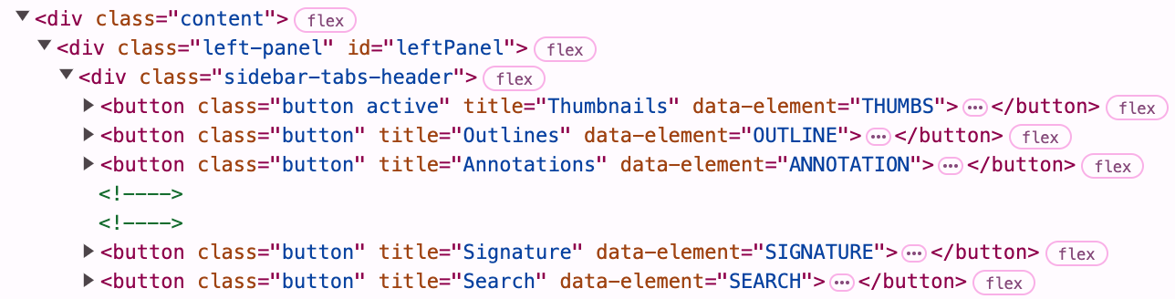
Confirm that the
data-elementattribute value of the annotation tag isANNOTATION;Use the
setActiveElementTabmethod to pass in the specified panel (leftPanel) and label (ANNOTATION) parameters.
ComPDFKitViewer.init(...)
  .then(instance => {
    const { docViewer, UI } = instance;

    docViewer.addEvent('documentloaded', async () => {
      console.log('document loaded');
      // Open the left panel
      UI.openElement('leftPanel');

      // Switch to the annotation tag in the left panel
      UI.setActiveElementTab('leftPanel', 'ANNOTATION');
    })
  });