
PDF Generation Template Editor
Open-source visual PDF generation engine with customizable templates and developer-friendly APIs.
One key part of customizing the UI is the customization of the navigation bar. There are several ways you may want to customize the navigation bar. To name a few:
ComPDF for Web's WebViewer UI provides flexible APIs for easy customization of the navigation bar.
To understand the structure of the navigation bar and the different types of tools, you can read The Composition of the Navigation Bar and Navigation Bar Tools. You can also jump directly to the UI Customization Samples to see examples of customizing the navigation bar.
The navigation bar is mainly divided into three parts: Navigation Tools, Feature Area, and the sub-menus of corresponding features (including sub-toolbars).
Navigation Tools: The icon buttons on the left and right sides of the image below (Navigation Bar) are the Navigation Tools.

Feature Area: The part inside the feature box in the middle of the navigation bar is called the Feature Area (as shown in the image below). Each feature has a different Sub-Menus. Buttons in both the Feature Area and the Sub-Menus can be modified individually. 
Sub-Menus: Under different Feature Areas, there are corresponding Sub-Menus showing a group of tools for that feature. ComPDF for Web provides various APIs to customize the tools within this Sub-Menus. Below, the Sub-Menus for annotations and forms are shown:


Find the Data Element Attribute of the Navigation Bar
To hide or show navigation bar elements, you first need to find the element’s data-element attribute in the DOM inspector.
For Example, the image below is the DOM of the Toolbar of the Feature Area.
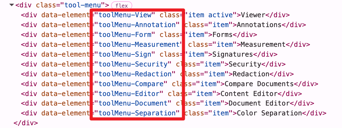
We can see that their data-element value. Now we can use this value to hide or show it.
Hiding/Showing Navigation Bar Elements
// Hide the annotation button in the feature area.
instance.UI.disableElements('toolbarGroup-Annotation');
// Show the annotation button in the feature area.
instance.UI.enableElements('toolbarGroup-Annotation');// Hide the left panel button and the search button.
instance.UI.disableElements(['leftPanelButton', 'searchButton']);
// Show the left panel button and the search button.
instance.UI.enableElements(['leftPanelButton', 'searchButton']);You can call setToolbarGroup to switch between the different feature modes in the Feature Area.
ComPDFKitViewer.init(...)
  .then(instance => {
    // Set the current toolbar group.
    instance.UI.setToolbarGroup('toolbarGroup-Annotation');
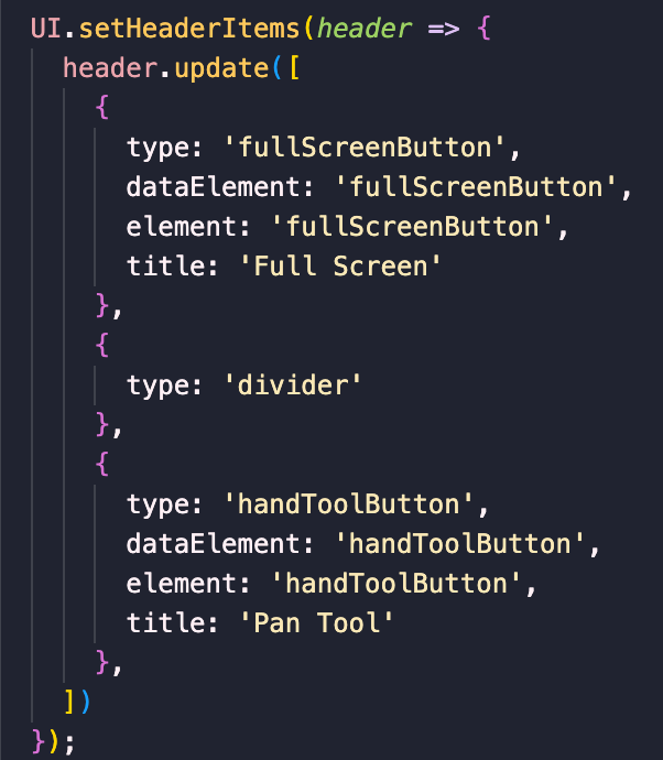
});Navigation Tools are objects with certain properties. You can add, remove, or move Navigation Tool buttons by calling setHeaderItems. If you would like to add custom tools to the navigation bar, it is crucial to understand what types of custom tools you need to add and which attributes to use. Below are the properties and types for Navigation Tools.
instance.UI.setHeaderItems(header => {
  header.update([
    {
      type: 'toolButton',
      dataElement: 'handToolButton',
      toolName: 'pan',
      icon: 'Pantool',
    },
    {
      type: 'toggleElementButton',
      dataElement: 'searchButton',
      element: 'searchPanel',
      icon: 'Search'
    },
    { type: 'divider' },
    {
      type: 'actionButton',
      dataElement: 'downloadButton',
      icon: 'Download',
      onClick: download
    }
  ]);
});1. Set the Header
Parameters for the setHeaderItems callback function: header object, can invoke get, getItems, shift, unshift, push, pop, delete, and update to perform corresponding operations on navigation tools and the toolbar.
instance.UI.setHeaderItems(header => {
  // Get all feature area.
  const items = header.getHeader('default').getItems();
  console.log(items);
});2. Action Button
An action button can trigger an action. This kind of button has no active state. Its properties include:
actionButton.data-element value of the button element. It can be used to disable/enable the element.desktop, tablet, mobile and small-mobile.const newActionButton = {
type: 'actionButton',
img: 'path/to/image',
text: 'Alert',
onClick: () => {
alert('Hello world!');
},
dataElement: 'alertButton'
};3. State Button
The state button is a customizable button. You can decide how many states it has, what state is active, and when to update the state. Its properties include:
statefulButton.states object's keys.activeState. activeState is an object that corresponds to the value of initialState in states.activeState. activeState is an object that corresponds to the value of initialState in states.data-element value of the button element.desktop, tablet, mobile and small-mobile.Examples:
A stateful button that shows the count. When you click it, it will increment the counter by 1.
const countButton = {
  type: 'statefulButton',
  initialState: 'Count',
  states: {
    Count: {
      number: 1,
      getContent: activeState => {
        return activeState.number;
      },
      onClick: activeState => {
        activeState.number += 1;
      }
    }
  },
  dataElement: 'countButton'
};A state button showing the current page number. When you click it, the document will go to the next page. If you are on the last page, the document will turn to the first page.
const nextPageButton = {
  type: 'statefulButton',
  initialState: 'Page',
  states: {
    Page: {
      getContent: Core.getCurrentPage,
      onClick: activeState => {
        const currentPage = Core.getCurrentPage();
        const totalPages = Core.getPagesCount();
        const atLastPage = currentPage === totalPages;

        if (atLastPage) {
          Core.previousPage();
        } else {
          Core.nextPage();
        }
        activeState.getContent = Core.getCurrentPage();
      }
    }
  },
  mount: () => {
    // Execute after mounting.
    console.log('Mounted.');
  },
  unmount: () => {
    // Execute before destruction.
    console.log('Destroyed.');
  },
  dataElement: 'nextPageButton'
};4. Toggle Element Button
The toggle element button is used to open/close a specified UI element. When the UI element is open, the button is in an active state.
Its properties include:
toggleElementButton.data-element UI element to be opened/closed.data-element button element value. It can be used for showing/hiding that element.desktop, tablet, mobile and small-mobile.const newToggleButton = {
type: 'toggleElementButton',
img: `path/to/image`,
element: 'pageModePanel',
dataElement: 'pageModePanelButton',
hidden: [ 'mobile' ]
};5. Tool Button
The tool button is the button in the sub-menus under the feature module. For example, in the Form feature mode, you can create a button for a text field function by customizing a tool button and specifying its element value as textfield. You can place the tool buttons you need to customize anywhere. When the tool is activated, the button is in an active state.
Its properties include:
toolButton.data-element button element value of the target tool.data-element button element value. It can be used for showing/hiding that element.desktop, tablet, mobile and small-mobile.const newToolButton = {
type: 'toolButton',
toolName: 'textfield',
dataElement: 'textfieldButton'
};6. Spacer
The spacer is just a div with a CSS attribute of flex: 1, used to occupy any remaining space in the tool. It is used to push buttons to each side of the default title.
Its properties include:
spacer.desktop, tablet, mobile and small-mobile.const newSpacer = {
type: 'spacer',
hidden: [ 'mobile', 'small-mobile' ]
};7. Divider
Divider renders a vertical bar with some margin to separate item groups.
Its properties include:
divider.desktop, tablet, mobile and small-mobile.const newDivider = {
type: 'divider',
hidden: [ 'mobile', 'small-mobile' ]
};Add a custom save button:
instance.UI.setHeaderItems(header => {
  const mySaveButton = {
    type: 'actionButton',
    dataElement: 'mySaveButton',
    img: `<svg width="14" height="14" viewBox="0 0 14 14" fill="none" xmlns="http://www.w3.org/2000/svg">
            <path d="M13 1L1 13" stroke="#BABABA" stroke-width="2" stroke-linecap="round" stroke-linejoin="round"/>
            <path d="M1 1L13 13" stroke="#BABABA" stroke-width="2" stroke-linecap="round" stroke-linejoin="round"/>
          </svg>`,
    onClick: function() {
      Core.download();
    }
  }
  header.push(mySaveButton);
});Hide the text field tool in the form function area and put it on the right side of the navigation bar:
instance.UI.setHeaderItems(header => {
  // get the freetext tool.
  const freetext = header.getHeader('toolbarGroup-Annotation').get('freetextButton');
  header.getHeader('toolbarGroup-Annotation').delete('freetextButton');
  // add the line tool to the top header.
  header.getHeader('default').push({
    type: 'toolButton',
    toolName: 'line',
    dataElement: 'lineButton'
  });
  // add the freetext tool to the top header.
  header.push(freetext);
});Remove existing buttons from the top header, leaving only the ribbon:
instance.UI.setHeaderItems(header => {
  const items = header.getItems().slice(9, -3);
  header.update(items);
});Display and hide of bottom page box:
// Show bottom page box.
instance.UI.disableElements('pageNavOverlay');
// Hide bottom page box.
instance.UI.enableElements('pageNavOverlay');